
Wrapping 2


Memory 1

Jane Packer is one of the most influential floral designers of our time. She has shops and schools in London , New York , Tokyo and Seoul London
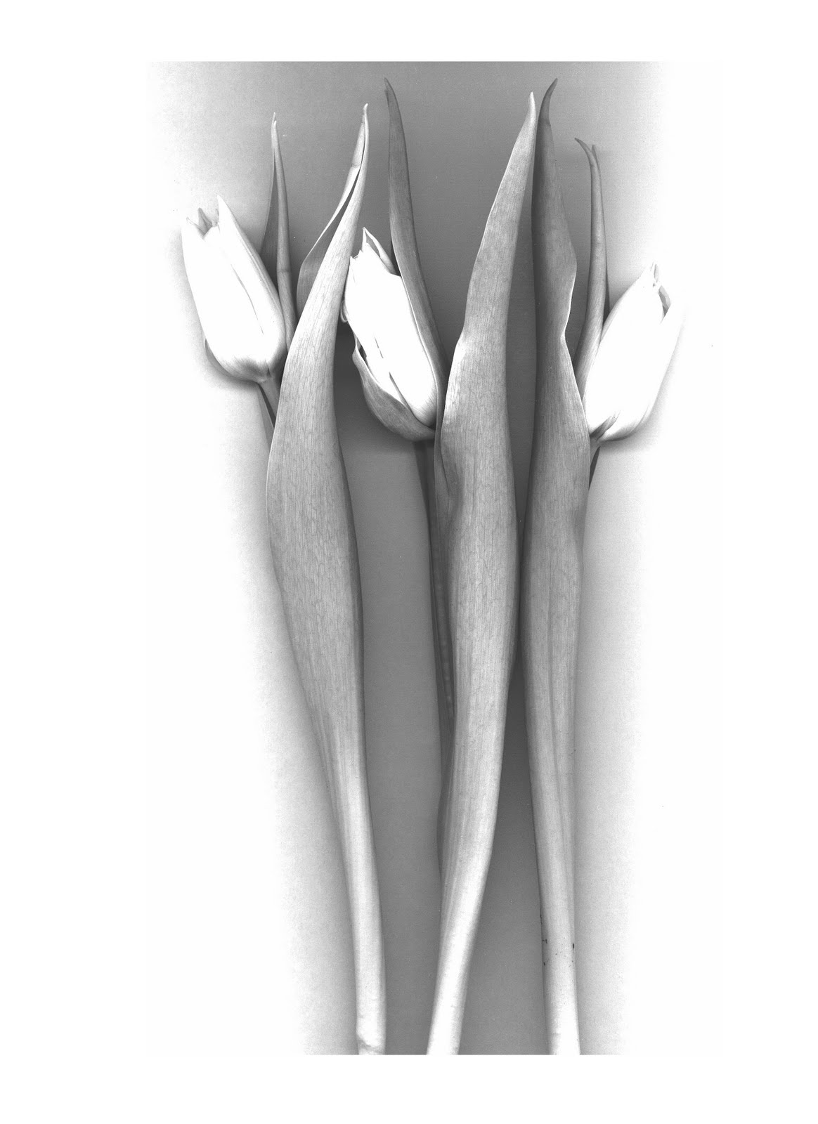
The original logo is of three tulips, I took this very literally and exchanged the tulip print with photographs (scans of tulips). The outcome is very sensual and also has a hint of botanical art. I also attempted various types of wrapping, some of the best examples are bellow, they use the original logo repeated on a black background, that suggest a very trendy simplistic approach. Finally to tie in with the interior that other members had designed I suggested the use of customer's private photos to be displayed in the shop and used as tags on gifts. Flowers are given to people during events, and hold fond memories, the use of photos of loved ones brings a personal touch to the brand expressing the designer's wish to bring happy memories through her floral art.
During the summer I plan on attempting a shop design to accommodate this branding. Keep checking the blog for when I post my design.
No comments:
Post a Comment